Accommodation of 65 m², approved for 5 people: 2 bedrooms upstairs, 1 large open room: living room, kitchen and dining room. A bathroom (shower) and separate WC.
Accommodation of 90 m², approved for 6 people : 2 bedrooms upstairs, 1 large open room: living room, kitchen / dining room. A bathroom (shower) and separate WC.
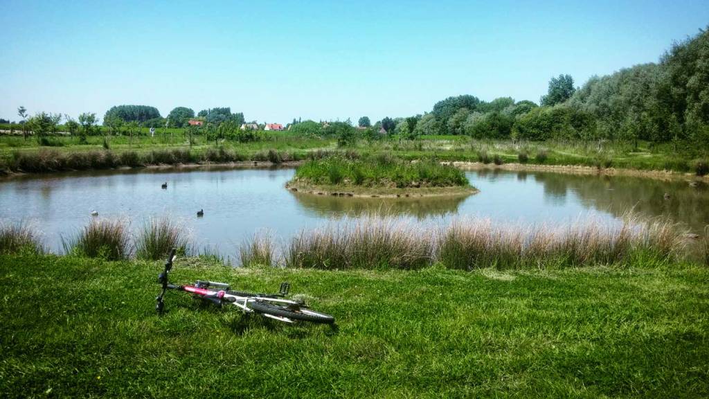
We are located in the small village of Nielles lès Ardres between Calais and Saint-Omer on the Côte d'Opale.
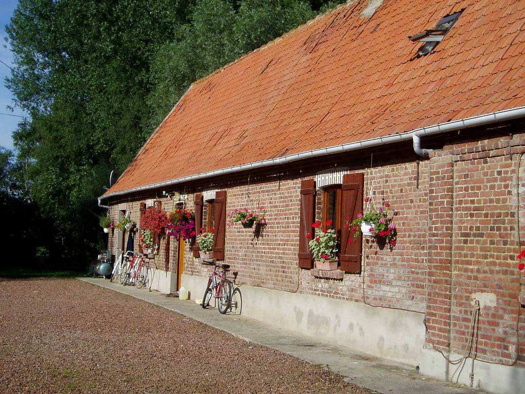
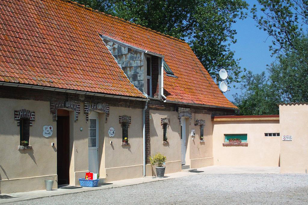
Our farm is typical of the north of France: in red bricks, with a square courtyard. Our accomodations are real holiday homes ideal for meeting up with family or friends, in any season.
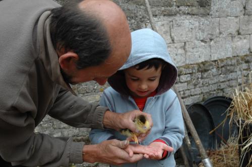
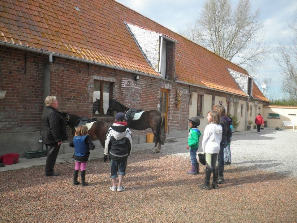
We have many pets including horses, chickens, ducks, goose, donkey, goat, ... they are our friends, they live their whole life with us (we don't eat them !).
We introduce holidaymakers to our profession : tractors, fields, chicken coop, ... and offer free activities such as horse riding initiation, horseshoe painting, egg picking, ...
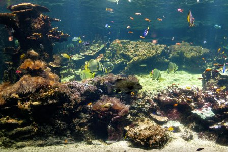
Cap Blanc-Nez is a cape on the Côte d'Opale. The cliffs are a perfect vantage point to see hundreds of ships, from oil tankers to little fishing trawlers, plying the waters below. On a clear day, the emblematic white cliffs of Dover on the English shore can be seen.
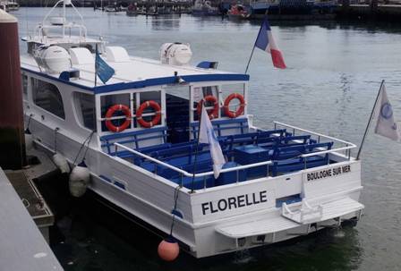
Drop the moorings and go discover the natural site of "Pointe aux Oies" or that of "Deux-Caps", classified "Grand Site de France" ! Relax and let yourself be guided by the captain who comments on the sites to discover.
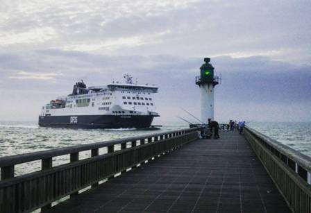
When you’ve finished building sandcastles and you want to see the ferries up close or point them out to the little ones, the jetty provides the perfect vantage point. It is a popular spot for anglers.
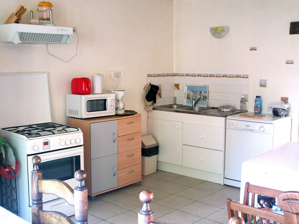
The gîte des Prés is located on the Côte d'Opale, in the countryside and on a farm between Calais and Saint-Omer. It is our largest gîte (up to 6 people).
It is composed :
On the ground floor, a large 45 m² studio with kitchen, living room and lounge (a a flat-screen TV (82 cm) with satellite decoder, DVD player, oven, microwave, coffee maker, dishes, washing machine - dishes, ...).
On the ground floor, a separate WC and shower room (+10 m²).
Upstairs, two bedrooms. The first with a 140 bed and the second with four 90 beds. (Sheets provided and beds made).
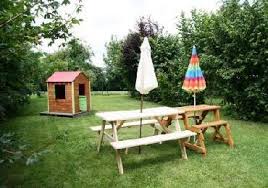
A private enclosed garden of 300 m² with fixed barbecue (stone).
One or two parking spaces in the farmyard (secure).
A laundry with a washing machine, next to the accommodation.
Sitting areawith a sofa bed and a 123 cm TV screen
Max 5 people
Size65 m²
One bathroom6 m²
Wi-Fifree
Minimum length of stay 2 nights
Weekly rate350 €
The gîte du Moulin is located on a farm, in the countryside, in the small village from Nielles lès Ardres (village located between Calais and Saint-Omer) and on the Côte d'Opale. Close to many sites to visit: tourist and historic.
Accommodation is provided for up to 5 people.
On the ground floor: 1 large studio of 34 m², with kitchen, living room and lounge (1 TV: 123 cm flat screen with satellite decoder, DVD player, oven, microwave, coffee maker, dishes, dishwasher, .. .). A separate WC and shower room (+6 m²).
A private enclosed garden of 200 m² with fixed barbecue (stone). Parking space (s) in the farmyard (secure). Upstairs: two bedrooms. The first with 1 bed in 140 and the second with 2 beds: 1 in 90 and 1 in 120. Bed sheets provided and beds made.
We offer guided activities, on site, free of charge, as for children: egg collecting in the henhouse, horse riding initiation (our horses and ponies are on site), table tennis, game of table football, horseshoe painting, ... depending on availability and weather.
Nearby (2-3 km) there is a petrol station, supermarket, discount store and many shops.
In the countryside between Calais and Saint-Omer, close to the beautiful beaches of the Côte d'Opale.
A real quiet holiday on a farm !
Very nice walks to do all year round in the village or a little further and with a guide if desired (local tourist office).
It is a 3 + 2 person holiday home.
On the ground floor: 2 rooms of 20 m², with kitchen-living room and lounge (2 TV: 82 cm flat screen with satellite decoder, DVD player, free WiFi, oven, microwave, coffee maker, dishes, etc.). 1 separate WC and shower room (+3 m²). 1 washing machine in the laundry shared by the 3 accommodations. 1 Private enclosed garden of 200 m² with barbecue. 1 or 2 Parking space (s) in the farmyard (secure). Upstairs: 1 bedroom for 3 people with 1 140cm bed and 1 90cm bed. In the living room, 1 sofa bed in 140. Bed sheets provided and beds made.
For multiple lines of code, use the <pre> element which defines preformatted text. It creates a new text block that preserves spaces, tabs and line breaks. Nest a <code> element inside to define the code block.
IMPORTANTBe sure to escape any angle brackets in the code for proper rendering.
<pre>
    <code>...</code>
</pre>
Lists
Create an unordered list using the <ul> element and the <ol> element for ordered lists. The <li> element defines the list item.
NOTEYou can also use additional UIkit classes for the lists. You will find more details here.
Description lists
Create a description list using the <dl> element. Use <dt> to define the term and <dd> for the description.
Description lists
A description list defines terms and their corresponding descriptions.
This is a term
This is a description.
This is a term
This is a description.
<dl>
    <dt>...</dt>
    <dd>...</dd>
</dl>
NOTEYou can also use additional UIkit classes for the description lists. You will find more details here.
Tables
You can easily create tables using the <table> element. Use <thead> to define the table headings, <tfoot> to define the table footers and <tbody> to define the table body.
NOTEYou can also use additional UIkit classes for the forms. You will find more details here.
Grid
This section shows how you can create different grids layouts with columns and rows.
Gantry5 Grid System
Gantry5 comes with its own CSS framework called "Nucleus". It is based on the Flexbox model and therefore is really flexible and allows you to build advanced layouts.
Gantry5 grid system or better said "Nucleus" grid system does not have a grid gutter, it uses the .g-content class instead.
As you can see in the above example, all 3 blocks are surrounded by empty space. This empty space comes from the .g-content class which adds some margin and padding to the element.
We have added a utility class to the template which takes care of the unnecessary spacing and makes the whole grid looks more natural. The utility class is called .g-gutter.
"Nucleus" comes with another very useful class called .size-# where # is the percentage of the whole width of the grid a particular element should occupy.
The grid system of UIkit follows the mobile-first approach and accomodates up to 10 grid columns. It uses units with predefined classes inside each grid, which define the column width.
To create the grid container, add the .uk-grid class to a parent element. Add one of the .uk-width-* classes to child elements to determine, how the units shall be sized. The grid supports 1, 2, 3, 4, 5, 6 and 10 unit divisions.
NOTEYou can also use additional UIkit classes for the alerts. You will find more details here.
Modal
This section shows how easy it is to use modals.
The modal component consists of an overlay, a dialog and a close button.
Class
Description
<.uk-modal>
Add this class to a <div> element to create the dialog container and an overlay that blanks out the page. It is important to add an id to indicate the element for toggling.
<.uk-modal-dialog>
Add this class to a child <div> element to create the dialog box.
<.uk-modal-close>
Add this class to an <a> or <button> element to create a close button within the dialog box. We recommend adding the .uk-close class from the Close component to give the button a proper styling, though you can also use text or an image.
You can use any element to toggle a modal dialog. An <a> element needs to be linked to the modal's id. To enable the necessary JavaScript, add the data-uk-modal attribute. If you are using another element, like a button, just add the data-uk-modal="{target:'#ID'}" attribute to target the modal's id.
Lorem ipsum dolor sit amet, consectetur adipisicing elit, sed do eiusmod tempor incididunt ut labore et dolore magna aliqua. Ut enim ad minim veniam, quis nostrud exercitation ullamco laboris nisi ut aliquip ex ea commodo consequat. Duis aute irure dolor in reprehenderit in voluptate velit esse cillum dolore eu fugiat nulla pariatur. Excepteur sint occaecat cupidatat non proident, sunt in culpa qui officia deserunt mollit anim id est laborum.
<!-- This is an anchor toggling the modal -->
<a href="#my-id" data-uk-modal>...</a>

<!-- This is a button toggling the modal -->
<button class="button" data-uk-modal="{target:'#my-id'}">...</button>

<!-- This is the modal -->
<div id="my-id" class="uk-modal">
    <div class="uk-modal-dialog">
        <a class="uk-modal-close uk-close"></a>
        ...
    </div>
</div>
NOTEYou can find more details and options about the modals here.
Lightbox
This section shows how easy it is to create a fancy lightbox for images and videos.
To apply this component, add the data-uk-lightbox attribute to an anchor linking to the image you wish to display. If a title attribute exists it will be displayed as a caption for the lightbox.
You can link multiple images to the same lightbox and switch between them from within the lightbox, thus creating a gallery. Just add the {group:'my-group'} option to the data attribute of each item using the same name on all items that you want to group.
A lightbox is not restricted to images. Other media, like videos, can be displayed inside a lightbox and it will automatically generate the correct output by evaluating your path.
NOTEYou can find more details and options about the lightbox here.
Tooltip
This section shows how easy it is to create a nicely looking tooltip.
To create a tooltip, add the data-uk-tooltip attribute to an element. You also need to add a title attribute, whose value will represent your tooltip's text.
NOTEYou can find more details about the tooltip here.
Tabs
This section shows how easy it is to create a tabbed navigation with different styles.
The Tab component consists of clickable tabs, that are aligned side by side.
Class
Description
.uk-tab
Add this class to a <ul> element to define the Tab component. Use <a> elements as tab items within the list.
.uk-active
Add this class to a list item to apply an active state.
.uk-disabled
Add this class to a list item to apply a disabled state.
The data-uk-tab attribute is required for two purposes. Firstly, it enables the responsive behaviour. If the parent container is too small to accomodate all tabs, they will be combined into a dropdown, toggled by a single tab, which represents the active tab item.
And secondly, its functionality is coupled to the Switcher component, which is necessary to dynamically transition through different contents using tabbed navigation.
There are many more options and layouts available for the tabs, for example centered tabs, tabs on the left, tabs on the right, etc. You will find all these details on the UIkit website.
NOTEYou can find more details and options about the lightbox here.
Accordions
This section shows how easy it is to create a list of items, allowing each item's content to be expanded and collapsed by clicking its header.
To create an Accrodion, add the uk-accordion class and the data-uk-accordion attribute to a container element. Add the uk-accordion-content class to each of the content sections within the container. Finally, add the uk-accordion-title class to any element, like a heading, above the content section to create a toggle.
Heading 1
Lorem ipsum dolor sit amet, consectetur adipiscing elit, sed do eiusmod tempor incididunt ut labore et dolore magna aliqua. Ut enim ad minim veniam, quis nostrud exercitation ullamco laboris nisi ut aliquip ex ea commodo consequat. Duis aute irure dolor in reprehenderit in voluptate velit esse cillum dolore.
Heading 2
Lorem ipsum dolor sit amet, consectetur adipiscing elit, sed do eiusmod tempor incididunt ut labore et dolore magna aliqua. Ut enim ad minim veniam, quis nostrud exercitation ullamco laboris nisi ut aliquip ex ea commodo consequat. Duis aute irure dolor in reprehenderit in voluptate velit esse cillum dolore.
Heading 3
Lorem ipsum dolor sit amet, consectetur adipiscing elit, sed do eiusmod tempor incididunt ut labore et dolore magna aliqua. Ut enim ad minim veniam, quis nostrud exercitation ullamco laboris nisi ut aliquip ex ea commodo consequat. Duis aute irure dolor in reprehenderit in voluptate velit esse cillum dolore.
UIkit is a lightweight and modular front-end framework for developing fast and powerful web interfaces. It comes with a wide range of reusable and combinable components. All UIkit classes are namespaced, so they won't interfere with other frameworks and extensions you might be using.
This entire site is subject to French and international legislation on copyright and intellectual property. All reproduction rights are reserved, including for downloadable documents and iconographic and photographic representations.
Reproduction of all or part of this site on any electronic medium is strictly prohibited without the express authorization of the publication director. Law No. 78-17 of January 6, 1978 relating to data processing, files and freedoms
In accordance with articles 38, 39 and 40 of law n ° 78-17 of January 6, 1978, relating to data processing, files and freedoms, you benefit from an individual right of access, rectification and deletion of personal information about you. Please send all requests in writing to the following address:
Mr LENGAGNE 5 rue du moulin 62610 Nielles-les-Ardres
What Our Guests Say
"The warm welcome from Dominique and Philippe. Philippe had lots of stories to tell us about the horses and the chicken. We loved the fact the kids got to feed the farm animals. The fenced off garden to let our dog run around. The gîte was close to local amenities and to the Eurotunnel but also not far from some really nice beaches."
"Very good family friendly location , we rented 2 gites, but would also be a great quick getaway for a couple seeking farm/country location as less than 30 mins from Calais port - Each Gite has its own well kept private garden with barbeque facilities. Bring your own towels.”


.jpg)
.jpg)
.jpg)
.jpg)
.jpg)

.jpg)
.jpg)
.jpg)
.jpg)
.jpg)

.jpg)
.jpg)


